Website Mockup, Mobile and Desktop View
Overview
Role
UI
Graphic Design
Front End Development
Client
Georgia Tech Center for Health Analytics and Informatics
Tools
Adobe Illustrator
Figma
HTML & CSS
Javascript
Duration
Summer/Fall 2021
Background
One of the most important projects assigned to me and my counterpart during my yearlong internship for the Center for Health Analytics and Informatics at Georgia Tech, OMOPonFHIR is GT's healthcare data mapping platform. We worked with the technical and logistical teams to develop an overall brand for OMOPonFHIR separate from its affiliation to GT. This included tasks such as creating a brand identity, building a social media presence, and designing as well as ultimately building a responsive website.
Mission Statement
Designed by both my counterpart and I, OMOPonFHIR's brand and UI/UX design gives clarity where there was none. The overall goal for the design is to generalize an intensely technical product, making OMOPonFHIR understandable and digestible for the layman reader and user.
Graphic Design- Developing a Brand Identity

Main Logo

Logo Variation

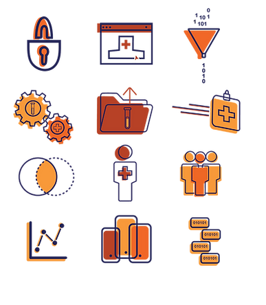
Web Icons

Color Scheme
Motifs and the Foundation
Above you see the key elements of the brand design for OMOPonFHIR, including the main logo, logo variations, various web icons, and the color scheme. The main logo depicts two flames, a play on the word FHIR (fast healthcare ineroperability reseource) read as Fire, and red bricks connecting the two representing the mapping attribute of OMOPonFHIR as well as the OMOP common data model itself. Additionally, the icon can stand on its own as representation of the software.
The logo variations show how data can be mapped to and from FHIR and OMOP equitably. Likewise the icons represent various aspects of OMOPonFHIR like database, security, and analytics.


The sketches represent the thought and iterative work that went into developing the OMOPonFHIR logo. My counterpart and I knew that in order to convey the software properly we needed to choose a design that was both professional but still eye catching. These are just a snapshot of the prospective designs for the main logo.
Motion Graphics
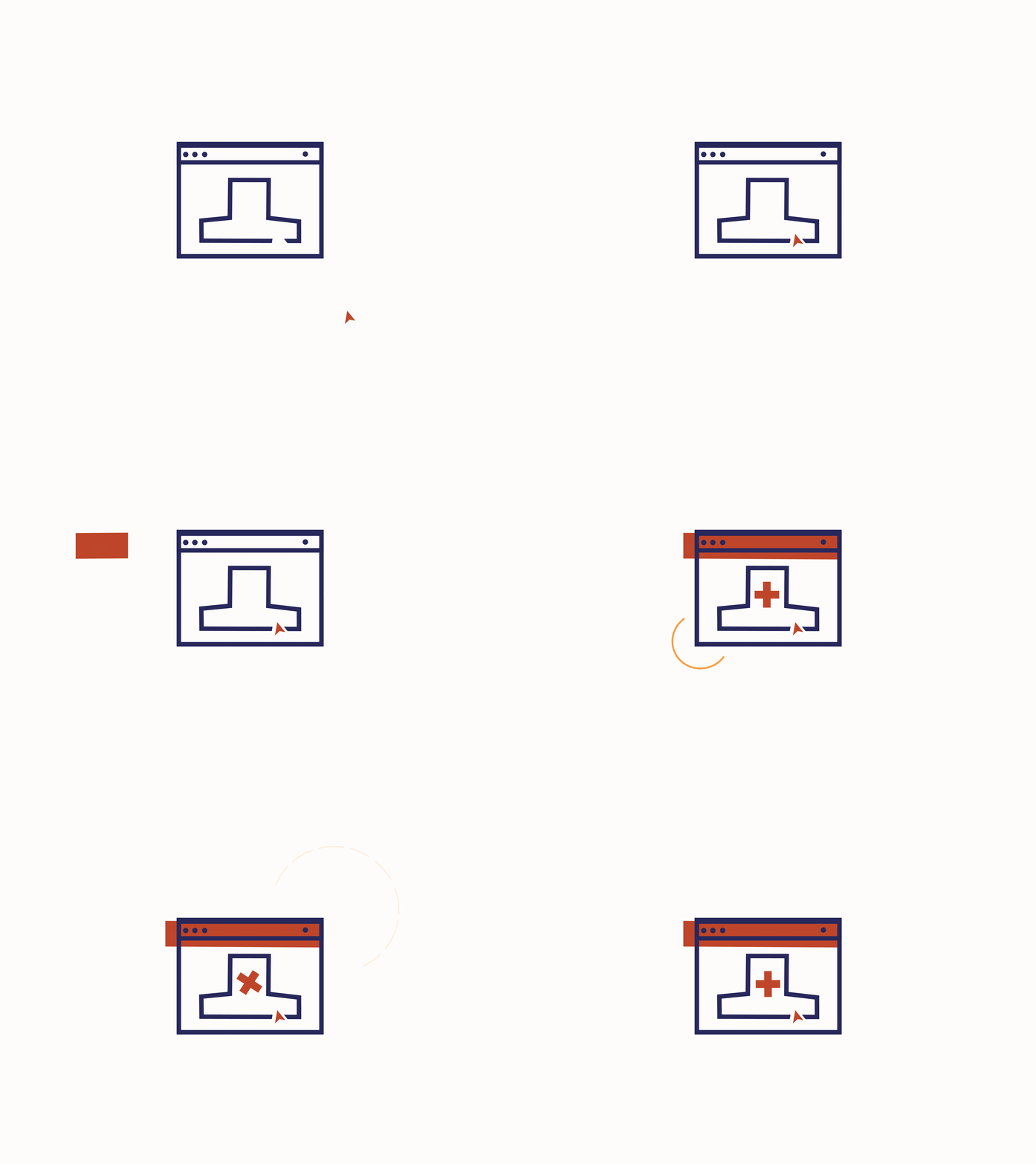
In order to bring some life to the brand, we developed a series of motion graphics to be used in various aspects of our project. Namely, on the website and on our various social media accounts. I personally created the three featured below. The motion graphics all portray elements of the technical side of OMOPonFHIR.


Social Media Graphics and Plan
Translating the bulk of OMOPonFHIR into digestable social media posts was one of the more challenging efforts of this project. Because it was so technical, we chose to keep the focus of the social media presence on the human stories that came with it. For example, introducing the team behind OMOPonFHIR and providing testimonials from users. We also reposted other posts that dealt with conferences and topics pertaining to OMOPonFHIR. Apart of the social media job was developing marketing strategies and posting schedules (an example of which you can see below).


UI Design
Hi-Fi Prototype
The working prototype is detailed below. Its design allows for easy understanding of OMOPonFHIR and its goals in both a desktop and mobile format in order to establish a responsive website design. The most notable challenge in the design was creating adequate space in order make the text readable. With the text being provided to us by our supervisor, we needed to visually create a hierarchy that allowed a user to easily read the dense text without cutting any of the wording itself.

Desktop View

Mobile View
Final Version
A few elements changed between the hi-fi prototype and the final running version of the website. Specifically, the content was shifted a fair amount: removing the demo video for OMOPonFHIR 2.0, as the update was not ready at the time of launch, a publications section was added, and motion graphics were embedded in a variety of places.

Reflections
My Musings
I really enjoyed working on this project. It was a major undertaking, completed between essentially two people. The design elements all came together in order to be cohesive without feeling stale. From conception to implementation, we worked through communication and technical struggles to meet the needs of the project. If I could continue the project, I would continue to develop the social media channels. Because this project was being worked on in conjunction with a number of others, the social media postings took a hit. Future efforts to expand the social media accounts, perhaps with video content and interactive posts would go a long way in marketing the brand of OMOPonFHIR.

